Dancer Milla Virtanen in the poster for NIGHTTOWN.
Breaking the two-year cycle between immersive pieces, Flow Productions has created a new work called NIGHTTOWN this year for the Lumo Light Festival in Oulu after last year’s hit VARIKKO. And so it is time to break down another poster image and explain how we got there!
NIGHTTOWN has a slightly different origin story than a regular Flow show. The piece is directed by Pirjo Yli-Maunula and created in collaboration by a multi-talented, multi-disciplinary team as usual, but the piece is also connected to a project called ULYSSES European Odyssey (UEO). The project is a celebration of James Joyce’s 1922 masterpiece, Ulysses, and it includes 18 cities in 16 different countries across the continent. The cities each have a chapter from Ulysses that they can engage with and produce artistic responses to. For Oulu and Flow Productions, the chapter in question is Chapter 15 – Circe.
Friends of the novel will remember that Circe is written as a play, with dialogue and stage directions. It is also a very long chapter, around 150 pages depending on your edition. The chapter is a wild ride into the Dublin night, where Leopold Bloom has hallucinatory episodes and fantasies, gets drunk, visits a brothel and is in quite a state throughout. The chapter is filled with strange visions: talking animals and objects, transformations, men turning into women, ghosts appearing etc. Sexual fantasies, desires, frustrations and guilt are overarching themes–among many, many, many, many others–and this atmosphere was a starting point in the creation of NIGHTTOWN. As the performance is dealing with carnal themes and visions, we wanted to create the same atmosphere with our poster image. An atmosphere of okay-this-is-not-one-for-the-kids craziness!
As always, Pirjo and I had a discussion about the themes and ideas for the actual performance and how they would translate into a photograph. A poster is the first entry into a work so it needs to communicate a feeling of what’s to come, a sentiment that will carry on to the show, even if the photographs are shot very early in the process. This time I photographed the image in early May, with the premiere being November 17. We settled on this female character (portrayed by the extraordinary Milla Virtanen), wearing a wreath and covered in some sort of ooze. I built a set on location, bringing a red painted canvas backdrop (from Zoom Backdrops) and some stands. The floor is tar paper and there are plastic sheets underneath protecting the actual floor because of the slime, which was actually cooking oil.
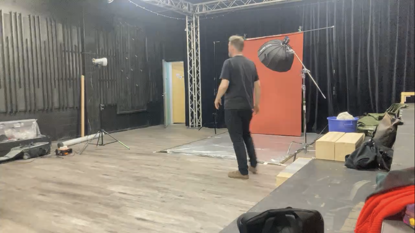
Lighting was pretty straightforward: one boomed Godox AD300 in a gridded softbox for key, camera right, and a gridded Elinchrom strobe to light the backdrop, camera left.
A screen grab from a cell phone timelapse. Lighting, backdrop and doofus in the middle!
Now, the interesting part is in front of the lens (isn’t it always? Ha ha.) I had set designer Heidi Kesti hold two pieces of red gel in front of my lens so I could shoot through them. The idea was to create a stroke of red color–in camera–but something that would still leave certain parts of the image more neutral in color. So, most of Milla’s body is red because of the red gel in front of my lens and her face is neutral because the gel was not covering my entire lens. This took a lot of shots and it is basically a numbers game. Some of the shots will work, while most of them will not. Heidi was also super patient with me: I could have just taped the gels to my lens hood but, well, so it goes. (We did want to have variations and some degree of control to it, fixed gels would always cover the same parts of the image.)
And here we are with the finished poster! Graphic design by Tomi Hurskainen.
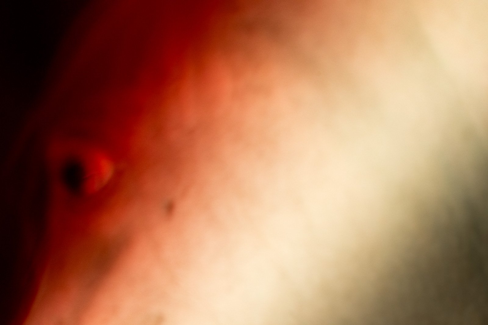
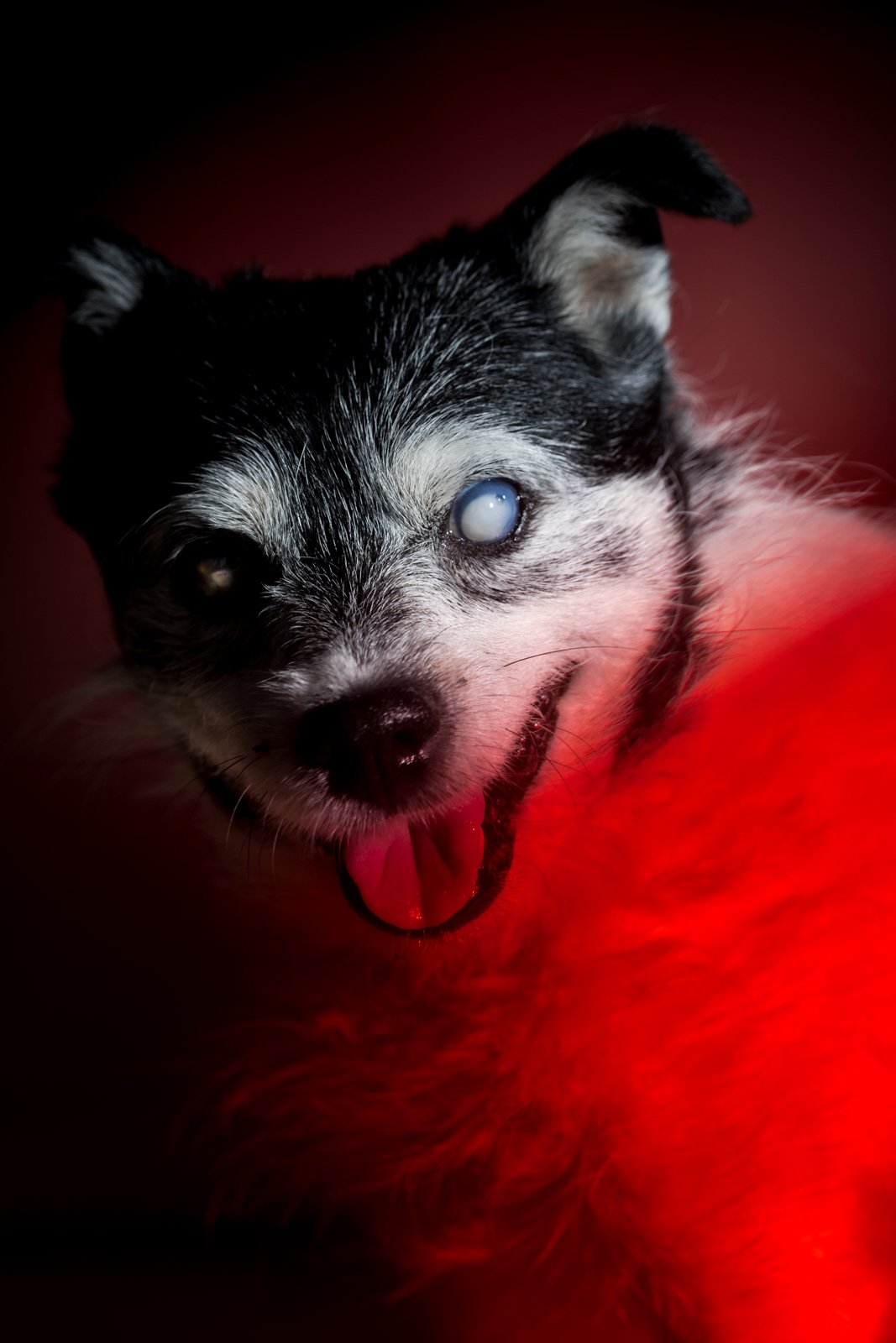
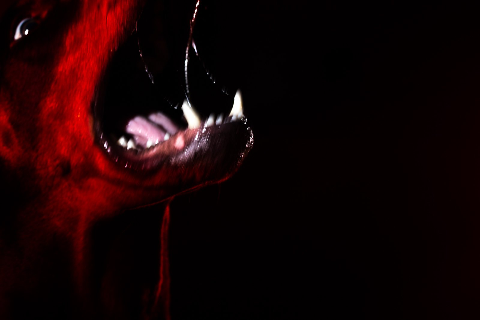
After our main image, we made sure to have a few variations on the theme. In the end we selected three more images to be used in the Flow Productions’ Fall programme. In addition to the poster shot, we selected these:
The red is a continuing color theme and in addition to these photographs, I also created images during the summer that are used as set design in the actual performance:
The photograph on the left and the photograph on the right are wall-sized, 3.4 and 4.5 meters wide, respectively. The dog in the middle is 1.9x1.3 meters. The dogs were photographed in studio with the same red gel idea, except this time I taped the gel to the lens hood. The horse is shot with available light in a stable, but there is still the red gel in front of the lens (and some heavy post-production.)
Dobermann on the wall. Director Pirjo Yli-Maunula directing dancer Henna-Maria Hanhineva. NIGHTTOWN is playing at Oulun Kulttuuripankki, a gallery space in and old Bank of Finland building in Oulu.
From the onset, the animal theme and the red color theme were something that we wanted to include in the show. Our trusted light designer Jukka Huitila brought in some really wonderful red neon tubes and used a lot of red in the color palette in the show. Animals will show up in some shape or other (remember transformation?) and I really feel that the early photography is really part of the same world as the actual show is.
The creation of the show has been incredibly inspirational and I feel privileged to be a part of another Flow Productions show. As I am writing this blog post, the premiere is only two weeks away and after the three-day festival November 17-19, we pack everything up and leave the space as it was. A tighter schedule this time, but the intensity of the piece is on par with everything Flow creates–if not more!
Many of the Flow Family regulars are involved in this piece, but there are a few new members in our team, too: circus artists Ben Collis and Elisabeth Künkele as well as dancers Henna-Maria Hanhineva and Nina Bulgakova. Also performing are Milla VIrtanen, Nikke Launonen and Anssi Laiho (who does double-duty as the sound designer). Circus artists Jared and Kat Van Earle were last seen in VARIKKO with Flow, and they return here. And our favorite Norwegian, circus artist Emma Langmoen, returns all the way from HYLKY (2020) and The SECRET GARDEN (2018). Costume design by Sylvi Siitavirta, set design by Heidi Kesti.
Premiere is next week and I can’t wait to put my camera down and enjoy NIGHTTOWN for myself. It’s all good!


